How Poor Lighting Is Quietly Draining Your Brand's Commercial Value

Photo: epSos.de, CC BY 2.0, via Wikimedia Commons
There is a persistent myth in commercial creative production: that post-production editing can compensate for almost any deficiency captured on set. Advanced retouching software, color grading tools, and AI-powered correction filters have reinforced this belief. Yet experienced photographers and directors of photography will confirm, without hesitation, that no amount of post-production investment can fully recover what poor lighting destroys at the source.
For brands commissioning photography and video content in today's saturated digital landscape, lighting is not a stylistic afterthought. It is a strategic asset — or a liability. And when it functions as the latter, the financial consequences compound across every channel where that content is deployed.
The Psychology Behind What Light Communicates
Before examining the technical failures, it is worth understanding why lighting carries such disproportionate psychological weight with audiences.
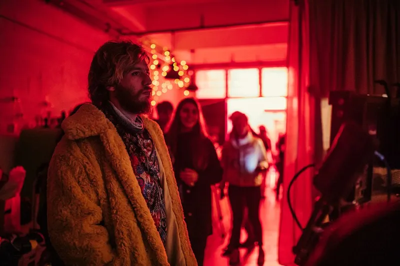
Human beings are biologically calibrated to read light as a cue for safety, trust, and emotional tone. Warm, directional light evokes intimacy and confidence. Flat, diffused light with no clear source can register subconsciously as clinical or evasive. Harsh, unmodified light creates tension and draws attention to imperfections rather than strengths.
In commercial contexts, these psychological responses translate directly into purchasing behavior. A 2022 consumer perception study conducted across e-commerce categories found that product images with professionally controlled lighting generated significantly higher click-through rates than those with ambient or unmanaged light sources — even when the product itself was identical. The implication is straightforward: your audience is evaluating your brand's credibility within fractions of a second, and light is the primary visual signal they are processing.
When a brand's photography looks flat, overexposed, or inconsistently lit across campaigns, the message received is not simply aesthetic. Consumers interpret visual inconsistency as operational inconsistency. They associate it with a lack of attention to detail — and by extension, a lack of care for the customer experience.
The Three Most Costly Lighting Mistakes in Commercial Production
Relying on Available Light Without Supplementing or Shaping It
Available light — whether natural sunlight through a window or overhead fluorescent fixtures in a commercial space — is unpredictable, uncontrollable, and rarely flattering to products or talent. Studios that work with brands on location shoots understand the appeal of natural environments; they offer authenticity and context. However, accepting whatever light a location provides without modification is one of the most common errors seen in mid-tier commercial production.
Consider a restaurant brand that commissioned a photo series to support a regional advertising campaign. The shoot was conducted during afternoon hours in the dining space, relying entirely on the ambient light filtering through large south-facing windows. The resulting images were unevenly lit — some frames overexposed near the windows, others underexposed in the interior. The food itself, the primary subject, appeared dull and lacked the textural detail that drives appetite appeal in food photography.
After reshooting with a controlled lighting setup — using diffused strobe lighting balanced to match the color temperature of the natural window light — the same dishes appeared vibrant, dimensionally rich, and visually compelling. The brand reported a measurable improvement in social media engagement and a notable increase in reservation conversions tied to the updated campaign imagery. The difference between the two shoots was not the food, the location, or the camera system. It was the light.
Mismatching Color Temperature Across a Campaign
Color temperature inconsistency is a subtler error, but its cumulative damage to brand identity is substantial. When a brand's visual library contains images shot under tungsten light (warm, orange-toned), mixed with images captured under daylight-balanced LED fixtures, and supplemented with video content recorded under cool fluorescent office lighting, the result is a fragmented visual identity.
Audiences may not consciously identify the source of the inconsistency, but they register it. Brand recognition depends in part on visual coherence — the same principle that governs logo consistency, typography standards, and color palette guidelines. Lighting temperature is an extension of that visual language, and when it varies without intention, it signals a lack of professional oversight.
For brands that distribute content across platforms — Instagram, their own website, YouTube, paid digital advertising — this fragmentation is amplified. Each platform renders color slightly differently, which means that temperature inconsistencies that appear minor during editing become pronounced in deployment.
Using Flat, Directionless Light to "Play It Safe"
Some brands and their internal marketing teams default to soft, even, shadowless lighting under the assumption that it is universally flattering and editorially neutral. In practice, flat lighting removes dimension, depth, and the visual contrast that makes subjects appear premium and authoritative.
This is particularly damaging for product photography in categories where tactile quality is a key selling point — luxury goods, handcrafted items, architectural materials, and food among them. The texture of a leather wallet, the grain of a reclaimed wood surface, the crust of an artisan loaf — these qualities are rendered invisible under flat light. The product appears manufactured and generic rather than crafted and distinctive.
Directional light, even when softened and carefully shaped, introduces the shadows and highlights that give objects three-dimensional presence on a two-dimensional screen. It is the difference between a product that a consumer wants to reach out and touch and one they scroll past without hesitation.
What a Strategic Lighting Brief Looks Like
Brands that consistently produce high-performing visual content share a common practice: they arrive at production with a lighting brief, not just a creative brief. This document outlines the emotional tone the imagery should convey, the color temperature standards that align with the brand's existing visual library, and any product-specific considerations that require particular lighting treatment.
Working with a studio that asks these questions before a single light is positioned is a meaningful indicator of professional rigor. At Goyal's Studio, the pre-production conversation about lighting is treated with the same strategic weight as discussions about talent, location, and messaging. It is not a technical footnote — it is a foundational creative decision.
The Return on Investing in Lighting Excellence
The financial case for prioritizing lighting in commercial production is not abstract. Brands that invest in properly lit photography and video report longer content lifecycles — images that remain visually competitive for eighteen to twenty-four months rather than requiring replacement within six. They report higher engagement rates across digital channels. And they report fewer revision cycles in post-production, which reduces both the time and the cost associated with delivering final assets.
Perhaps most significantly, well-lit commercial content builds cumulative brand equity. Each image and video frame that reflects professional craft reinforces the consumer's perception that this brand takes quality seriously. That perception compounds over time, translating into loyalty, advocacy, and premium price tolerance.
Light, ultimately, is not just a technical element of production. It is the medium through which your brand's story is either told with authority or undermined before the first word is read.